|
|
 |
« on: November 24, 2007, 01:11PM » |
|
Okay, the membership hath spoken. By a somewhat significant majority (73 to 2) it has been decided that we should have a logo that is unique to our forum. So, what's it gonna look like? Use this thread to post your ideas, your graphics, or links to your graphics if they're too big to fit in a post.
|
|
|
|
« Last Edit: January 14, 2008, 03:53AM by OldFatGuy »
|
 Logged
|
If anyone has my r_ropes@bellsouth.net email address saved, you can delete it. I got tired of subsidizing AT&T. |
|
|
|
|
|
|
|
« Reply #2 on: November 24, 2007, 06:32PM » |
|
Kathleen, let's have one that won't scare small children!
|
|
|
|
|
Logged
|
|
|
|
|
|
|
« Reply #3 on: November 24, 2007, 07:12PM » |
|
All right, I'll pioneer by posting both the logos I made and posted in the last thread.  and 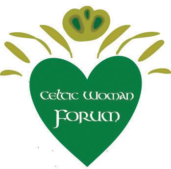 |
|
|
|
|
Logged
|
When you think of me
sing a heart-spun song
When it's over,
sing it once more.
When you dream of me
dream when I'll meet you
on that distant shore.
|
|
|
|
|
|
« Reply #4 on: November 24, 2007, 07:13PM » |
|
O my word! I love the first one! The second one is cool too, but I love the Knot!
|
|
|
|
|
Logged
|
 Thank you, Siobhan! |
|
|
|
|
|
« Reply #5 on: November 25, 2007, 01:15PM » |
|
I do like the knot, however it seems almost too "busy" for a logo. To me, a logo should be a little more simple, yet elegant, something that is going to be easier to adjust size on for various uses, so this isn't a criticism, just an opinion.
This thought, however, is coming from someone with absolutely NO artistic talent whatsoever, which means I can't actually offer anything besides my thoughts, so take it as you feel appropriate
|
|
|
|
|
Logged
|
|
|
|
|
|
|
« Reply #6 on: November 25, 2007, 01:21PM » |
|
I do like the knot, however it seems almost too "busy" for a logo. To me, a logo should be a little more simple, yet elegant, something that is going to be easier to adjust size on for various uses, so this isn't a criticism, just an opinion.
This thought, however, is coming from someone with absolutely NO artistic talent whatsoever, which means I can't actually offer anything besides my thoughts, so take it as you feel appropriate
I agree about the simple elegance. I dislike my knot as well and don't even consider it a real option for a logo, but I thought for the sake of including everything I'd post it in here anyway.  Thank you for your compliments, Emma! |
|
|
|
« Last Edit: November 25, 2007, 01:40PM by Siobhan »
|
Logged
|
When you think of me
sing a heart-spun song
When it's over,
sing it once more.
When you dream of me
dream when I'll meet you
on that distant shore.
|
|
|
|
|
|
« Reply #7 on: November 25, 2007, 02:26PM » |
|
I like the second one, Siobhan  It kinda reminds me of a Claddagh ring Maybe you and JRRacing could work together on something, you 2 are the best artist imho  |
|
|
|
|
Logged
|
Wel, here's a map and here's a bible, if you ever lose your way  By Scott  Ty Rich! |
|
|
|
|
|
« Reply #8 on: November 26, 2007, 03:35PM » |
|
I agree about the simple elegance. I dislike my knot as well and don't even consider it a real option for a logo, but I thought for the sake of including everything I'd post it in here anyway. Siobhan, Just to clarify, I didn't mean that I do not like the knot, actually I think it's great. I just wonder about how it would work as a logo. Your design is definitely very pretty though |
|
|
|
|
Logged
|
|
|
|
|
|
|
« Reply #9 on: November 26, 2007, 03:39PM » |
|
Where did the fancy green CWF emblem go with the gold crown?
|
|
|
|
|
Logged
|
 Banner by Scott IDIC - Live long and prosper |
|
|
|
|
|
« Reply #10 on: November 26, 2007, 04:23PM » |
|
I really like this one! * pick it* |
|
|
|
|
Logged
|
 made by JRRacing |
|
|
|
|
|
« Reply #11 on: November 26, 2007, 04:29PM » |
|
Here's the one I posted in the other thread.  |
|
|
|
|
Logged
|
|
|
|
|
|
|
« Reply #12 on: November 26, 2007, 06:19PM » |
|
That's very great. You can design the ones that go for the stuffed bears.
|
|
|
|
|
Logged
|
 LOOK OUT! ROGUE ROBOTS! LOOK OUT! ROGUE ROBOTS! |
|
|
|
|
|
« Reply #13 on: November 27, 2007, 02:44PM » |
|
Up to now I like JRRacing64's most (the others are cool, though, too!!), but could we perhaps leave the crown out of it?
|
|
|
|
« Last Edit: November 28, 2007, 10:13AM by Fiddle_Addict »
|
Logged
|
|
|
|
|
|
|
« Reply #14 on: November 27, 2007, 03:11PM » |
|
Up to now I like JRRacing64's most (the others are cool, thoug, too!!), but could we perhaps leave the crown out of it?
Here's the pre crown on as well  |
|
|
|
|
Logged
|
|
|
|
|
